Edit elements
This page provides guidance on working with specific elements in components.
There are two main ways to work with formatting:
the Format menu in the Menubar.

the Toolbar.

Note
Note that the Toolbar also contains other options, such as inserting sections, saving, and spellcheck.
Both these methods work in the same way.
Select the text you want to format.
Note
You can also place the cursor anywhere inside an element to produce an empty (formatted) element.
Choose your formatting option from either the Format menu or one of the icons in the Toolbar.
For an overview of the various icons and keyboard shortcuts used for formatting and other functions, please refer to the Icons and keyboard shortcuts page.
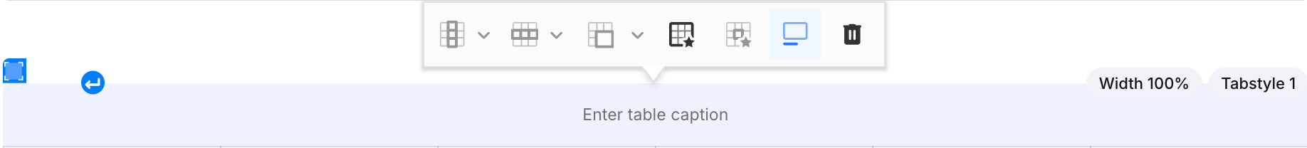
While it is still possible to adjust tables and cells by setting attributes on individual table elements, the easiest and fastest way to work with tables is to use the Table toolbar.
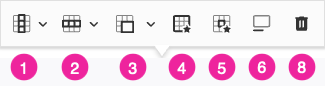
Columns
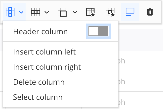 |
Place your cursor in any cell in the column you want to affect.
From the Table toolbar select the Column icon (1).
In the dropdown you can choose from the following options:
Header column (toggles header column on and off)
Insert column left
Insert column right
Delete column
Select column
Rows
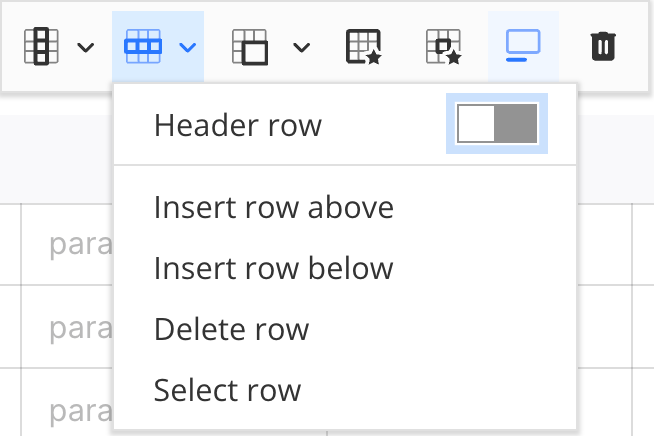 |
Place your cursor in any cell in the row you want to affect.
From the Table toolbar select the Row icon (2).
In the dropdown you can choose from the following options:
Header row (toggles header row on and off)
Insert row above
Insert column below
Delete row
Select row
Merge and split cells
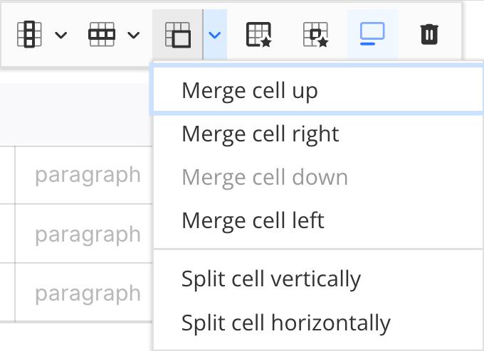 |
Place your cursor in the cell you want to affect.
From the Table toolbar select the Row icon (3).
In the dropdown you can choose from the following options:
Note
Depending on your cursor placement, one or more options may not be available for that particular cell.
Merge cell up
Merge cell right
Merge cell down
Merge cell left
Split cell vertically
Split cell horizontally
Table properties
In the table properties you can set the width of the table.
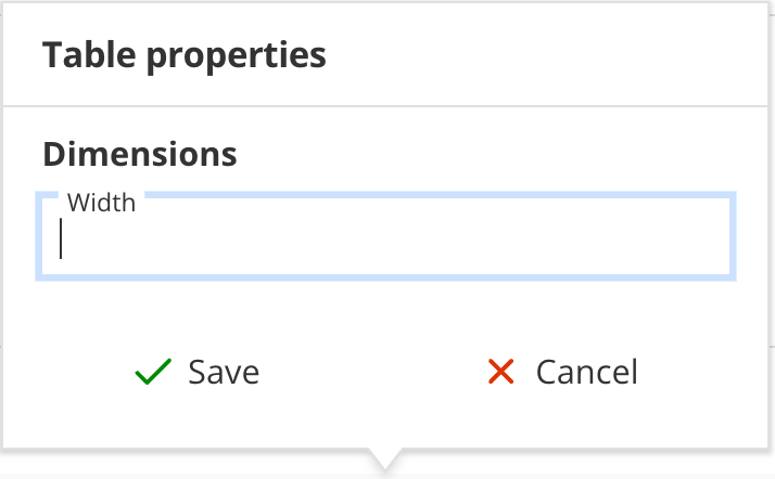 |
Place your cursor anywhere inside your table.
From the Table toolbar select the Table properties icon (4).
Set the table width in the Width field.
Note
Widths can be set in percentages (%), pixels (px), centimeters (cm) and millimeters (mm).
Cell properties
Here you can set properties such as cell width and text alignment for individual cells.
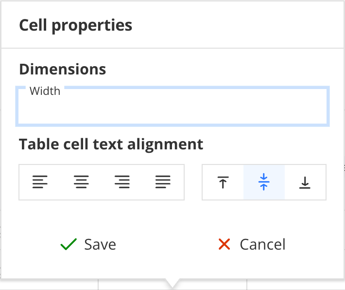 |
Place your cursor in the cell you want to affect.
From the Table toolbar select the Cell properties icon (5).
In the dropdown you can choose from the following options:
Cell width
Note
Widths can be set in percentages (%), pixels (px), centimeters (cm) and millimeters (mm).
Horizontal text alignment
Vertical text alignment
Table captions
Toggle the table caption on or off.
 |
Place your cursor anywhere inside your table.
From the Table toolbar select the Toggle caption icon (6).
Select the icon again to turn the caption off.
Delete table
Place your cursor anywhere inside your table.
From the Table toolbar select the Delete icon (7).
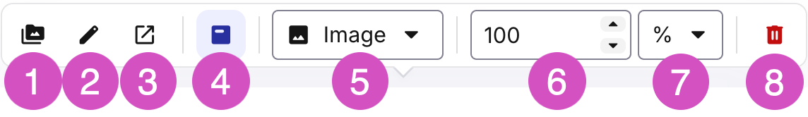
The easiest way to adjust image properties is by using the Image toolbar. You can also set image properties by assigning attributes to image elements.
Replace an image
To replace an image with another image:
Select the image.
From the Image toolbar select the File browser icon (1) to open the Image file browser
Browse to the desired image or upload a new image and select it.
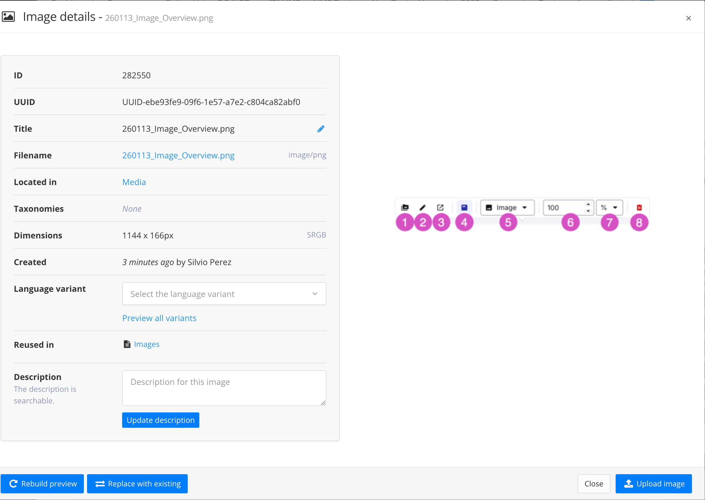
Edit image details
Select the image.
From the Image toolbar select the Edit image details icon (2) to show the image details window.
In the image details window you can:
Edit the title
Select the language variants
Update the image description
Replace the image with an existing image, or upload a new image.
Open image location
The Open image location function lets you open the image's parent folder in a separate browser tab.
Select the image.
From the Image toolbar select the Open location in new tab icon (3).
A new browser tab opens showing the contents of the image's parent folder in the Content manager.
Image caption
Select the image.
From the Image toolbar select the Toggle caption icon (4) to toggle the image caption on or off.
'Switch between Image and inline image
You can toggle between Image and Inline image.
Select the image.
From the Image toolbar select the Image/Inline image dropdown (5) and select Image or Inline image.
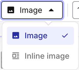
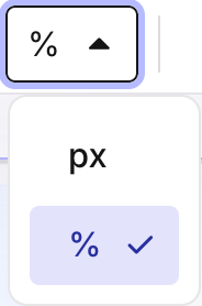
Image width
Select the image.
From the Image toolbar select the Image width field (6) and enter the image width.
From the Image toolbar select the Unit field (7) and set it to either percentage (%) or pixels (px).
Delete image
Select the image.
From the Image toolbar select the Delete icon (8).
Inserting links can be done via the Insert menu in the Menubar.
Place your cursor where you want to insert the link, or select existing text you want to use as the link text.
From the Menubar select Link, then select Cross reference or External link.
Working with lists works in much the same way as in other writing programs. Most of the actions required can be performed through the keyboard.
Create a list
Create a new paragraph
Convert the new paragraph to a list by:
using one of the list icons in the Toolbar
using the Element context menu and search for the list type you want, e.g. itemizedlist, orderedlist, or ptocedure.
Nested lists
Nested lists are made by adding a regular list item, and then indenting that item to create a nested list.
Place your cursor at the end of the list item you want to create a nested list for.
Press Enter.
Convert the newly created list item into a nested list by:
pressing the Tab key.
from the Toolbar select More options, then Indent list item

Note
If the nested list is not of the correct type, place your cursor in any of the list items of the nested list and use the list item icon in the Toolbar to convert the nested list.
Note
You can outdent a nested list item by placing the cursor anywhere in the list item you want to outdent, and then:
pressing Shift + Tab.
from the Toolbar select More options, then Outdent list item

Reuse list items
In technical publications, it is quite common to have list items and steps that are repeated in various different topics. For example, if you are documenting software, it is likely that you will use a 'Save' step in lots of different procedures.
In Paligo, there are two different ways to reuse steps. You can use:
The reuse text feature for single list items or steps.
An informal topic to reuse a sequence of list items or steps.
Reuse single list items or steps
Insert a new empty list item.
Using the Reuse text widget, search for and insert the text you want to use as the list item.
Note
For more information on usin the Reuse text feature, see Insert Reusable Text Fragment.
Reuse a sequence of list items or steps
When reusing a sequence of list items or steps, it is important to place the reused informal topic in the correct position in the structure to avoid creating invalid XML structures. The informal topic containing the reused items/steps should be placed before or after a lit item or step, not after the paragraph inside a list item or step.
Place the cursor anywhere inside the list item before or after which you want to insert the informal topic.
In the Element context menu, select the
listitemelement (not theparaelement inside thelistelement) and choose Insert element > Insert before or Insert after.In the Element insert menu, select
parato insert an ampty paragraph.With the cursor inside the newly created empty paragraph, from the Menubar select Insert and then Component.
In the Import content window, select the informal topic you want to insert.