Interface overview
The Next-gen editor interface is divided into four main sections:
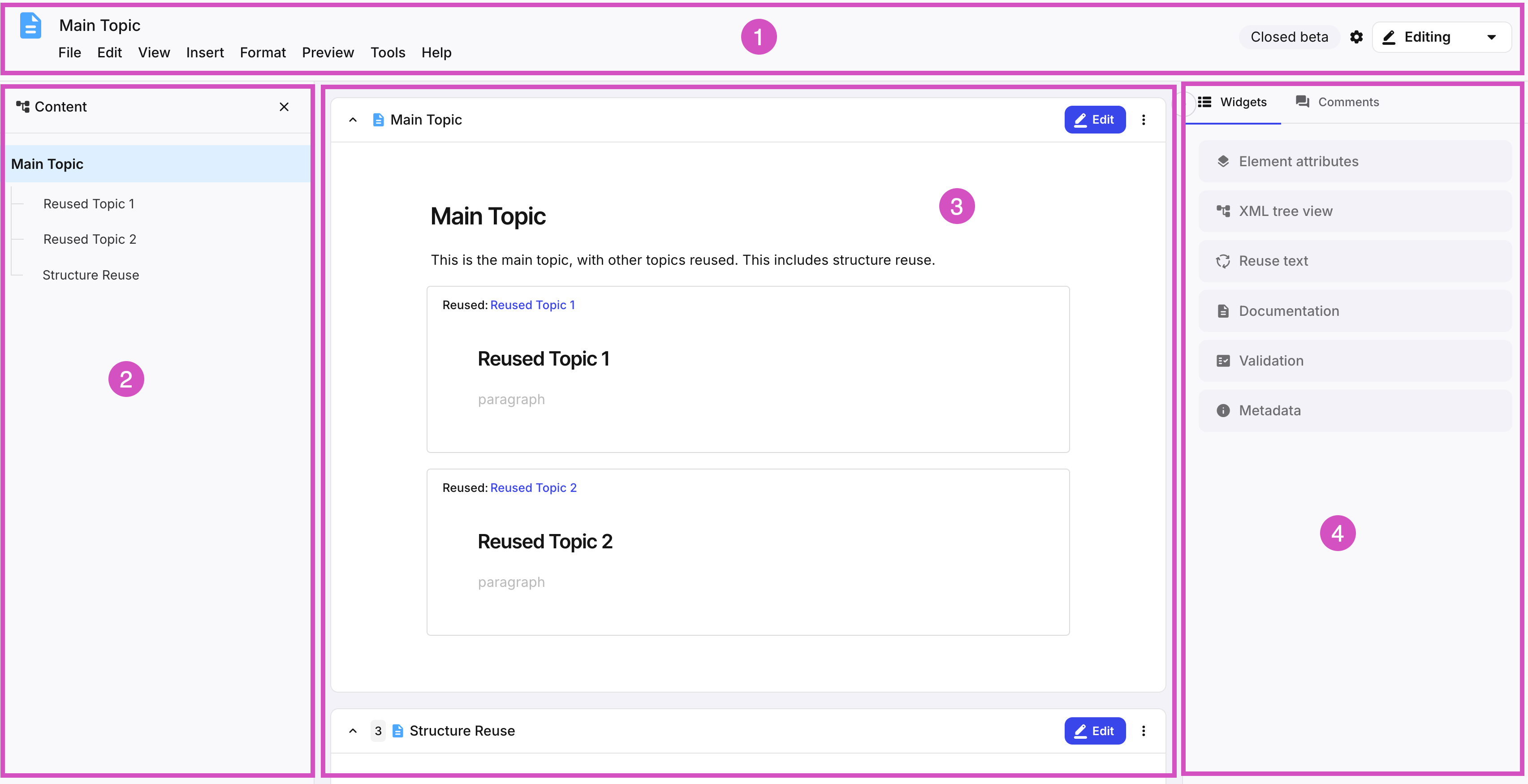
The Editor header shows different information depending on whether or not a component is open for editing.
It contains, among other things the component name, as well as the Menubar, the Toolbar and the Element structure menu. It also show the save status of the component in question.
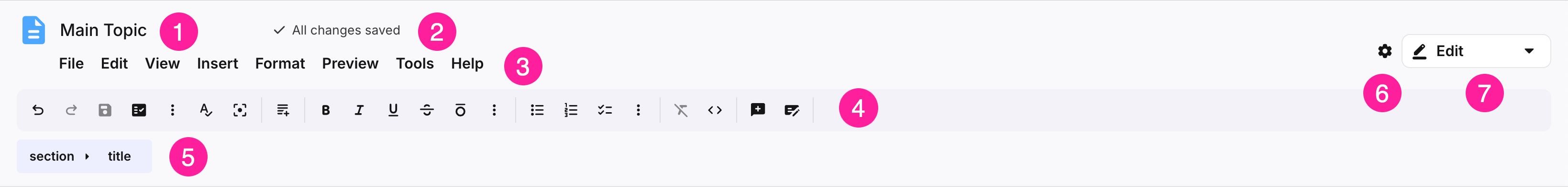
Component name
Save status indicator
Menubar
Toolbar
Element structure menu
Editor settings
Mode switcher
The Content structure pane provides an easily accessible overview of all components that are used in the current document, and allows you to easily navigate to those individual components.
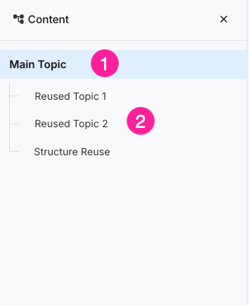
Component name
Reused and structure reused components
The Editing area is where you will do most of your work. Here you will write your content, add images, and reuse other components.
The Editing area is meant to be used as a regular document editor, but the underlying structure is still DocBook XML. It gives you an easy way to access all elements, formatting options and components you will need to write your documentation.
See also Edit components for more information about editing components.
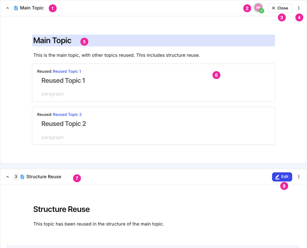
Component name
User currently editing the document
Edit/Close edit button
More options menu
Title element
Reused component
Component section (structure reuse component)
Note
Note that components that have been inserted as structure reuse can be edited in place, while regular reused components (such as number 6), need to be opened in a separate tab in order to edit them.
Edit/Close edit button
The Side pane contains both the widgets used to enhance your document, as well as the comments left by authors, contributors and reviewers.
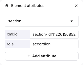
The Element attributes panel shows the attributes that are in place for the currently selected element. It is used to add, remove, edit and profile / filter an attribute and set its value.
Each element, such as a para, has its own properties, which are called attributes. When you add an attribute to an element and set its value, it only affects the specific element you selected. For example, if you add a filter element such as xinfo:country to a paragraph, it only applies to that paragraph and will not affect any other para elements.
It is only possible to choose attributes that are valid for the type of element selected, for example, an imagedata element can have a width attribute. By adjusting the value of the width attribute, the size of the image is set. By using a percent sign (%) after the value, the image can be scaled. A width attribute cannot be set on a para element.
 |
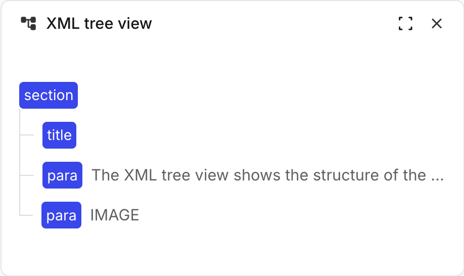
XML tree view panel
The XML tree view shows the structure of the topic that you have open in the main Paligo editor. For writers, it is especially useful as it means you can see the elements you have in place all at once, and it also makes it much easier to move blocks of content to new positions. You can drag an element from one (valid) position in the XML tree to another and your topic will update automatically to match. It is also possible to select and move multiple blocks at once by selecting while holding CMD (Mac) or CTRL (Windows).
 |
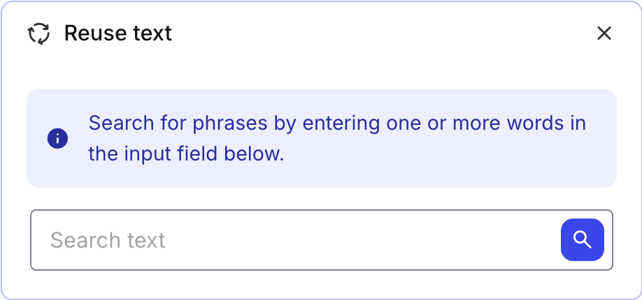
Reuse text panel
The Reuse Text panel is where you can search for existing text fragments in the database. If you are writing a paragraph or an instruction that you think may exist, you can search for it and reuse the existing version. Rather than repeatedly recreating recurring phrases, you write it once and reuse it wherever needed. Then, if the text ever needs to change, you can make the change once and it will apply to every instance automatically. To learn more, see Find Reusable Content and Reuse Text Fragments.
When a term is entered in the search field, a list of exact and close matches is presented in the Reuse Text panel. You can insert a match or access information about it via the cogi con. To the right of each match, the xml id is shown.
 |
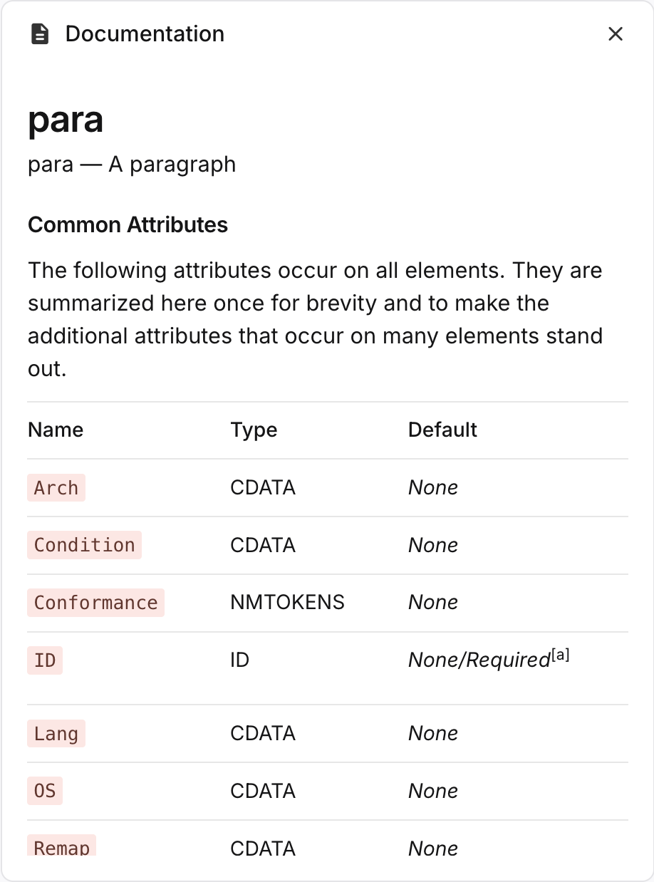
Documentation panel
The Documentation panel provides information about the currently selected element. It shows a list of Common Attributes that are often used with that element, with a brief description of each attribute. There is also a Description of the selected element, which is shown at the bottom of the documentation section.
 |
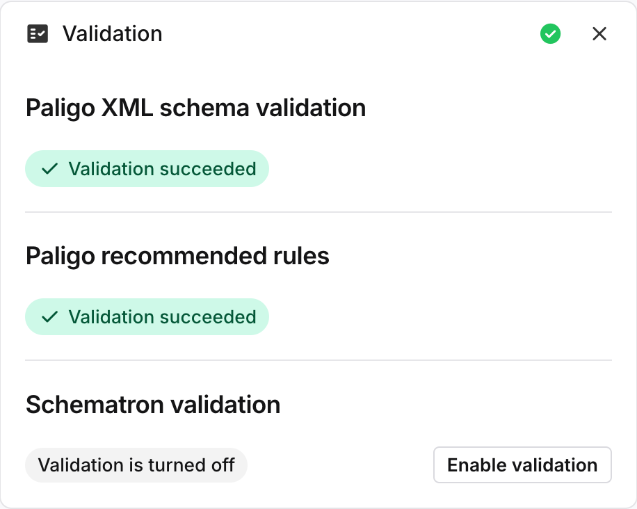
Validation panel
Your content is automatically validated by Paligo before it is saved to the database. You can turn this feature on and off, see Turn Validation On or Off. It is also possible to validate the content manually, see Validate Content Manually.
If your content have broken any of the Validation Rules, Paligo displays an error message and adds a red highlight to the element. The Validation Panel provides information about the error to help you solve it, see Invalid Content.
 |
Metadata panel
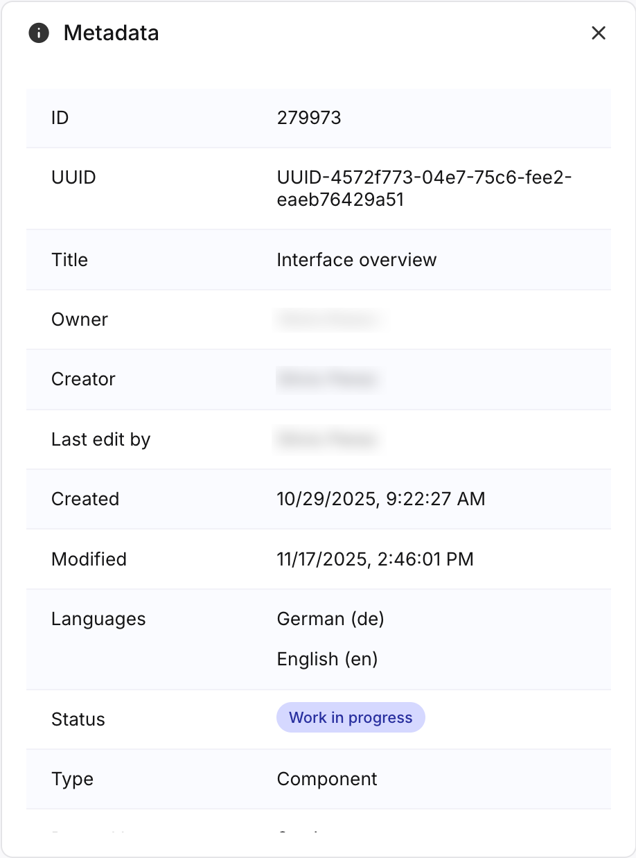
The Metadata panel shows all the metadata associated with the current document. Additionally, it shows where the current component is used, as well as which taxonomies have been applied to it.
 |